Qualitative research is no longer limited by data collection. It’s limited by analysis speed, synthesis quality, and team bandwidth.
Interviews, open-ended surveys, usability sessions, customer feedback, and voice transcripts generate rich insight—but only if you can structure, code, and interpret them efficiently. For most researchers today, the bottleneck isn’t talking to users. It’s turning messy qualitative data into clear, defensible insight before stakeholders lose patience.
That’s why qualitative data analysis software matters more than ever in 2026.
Modern QDA tools don’t just store transcripts or support manual coding. The best ones help researchers:
In this guide, we break down five of the most widely used qualitative data analysis software tools—from AI-native platforms to established academic standards. For each tool, we cover what it’s best at, where it struggles, and who should actually use it based on real research workflows, not feature checklists.
If you’re choosing between speed vs rigor, solo work vs collaboration, or AI assistance vs manual control, this comparison will help you make that trade-off explicit—before you commit time, budget, and team effort.

Overview:
Usercall offers AI-driven qualitative data analysis and data capturing through customizable AI coding and analysis tools as well as AI agent that moderates user interviews.
Key Features:
Pros:
Cons:
Why It Stands Out:
I've used the AI coding tools and AI moderated interviews for our own research projects. It's 10x'ed our productivity and output while having full control over the quality.
Tip:

Overview:
Dedoose is a cloud-based software well-suited for teams working remotely or projects that require a more flexible pricing model. Its focus on mixed methods makes it versatile for a broad range of studies.
Key Features:
Pros:
Cons:
Why It Stands Out:
I once collaborated with colleagues spanning three continents. Dedoose’s cloud-based framework allowed real-time coding updates—a crucial advantage given our varied time zones.
Tip:

Overview:
NVivo has long been a staple in qualitative research. It’s known for its robust coding capabilities and visual tools, making it a go-to for many academic and professional researchers.
Key Features:
Pros:
Cons:
Why It Stands Out:
In one community needs assessment project, NVivo’s visualization features helped my team quickly spot overlapping themes—something that saved us hours of manual cross-referencing.
Tip:

Overview:
ATLAS.ti excels at handling complex projects and diverse data types, from text to audio and video. Its “network view” feature is a major draw for researchers who like to visually map relationships between themes.
Key Features:
Pros:
Cons:
Why It Stands Out:
On a cross-departmental health study, we found ATLAS.ti’s collaboration tools particularly helpful because multiple analysts could work simultaneously without overwriting each other’s efforts.
Tip:

Overview:
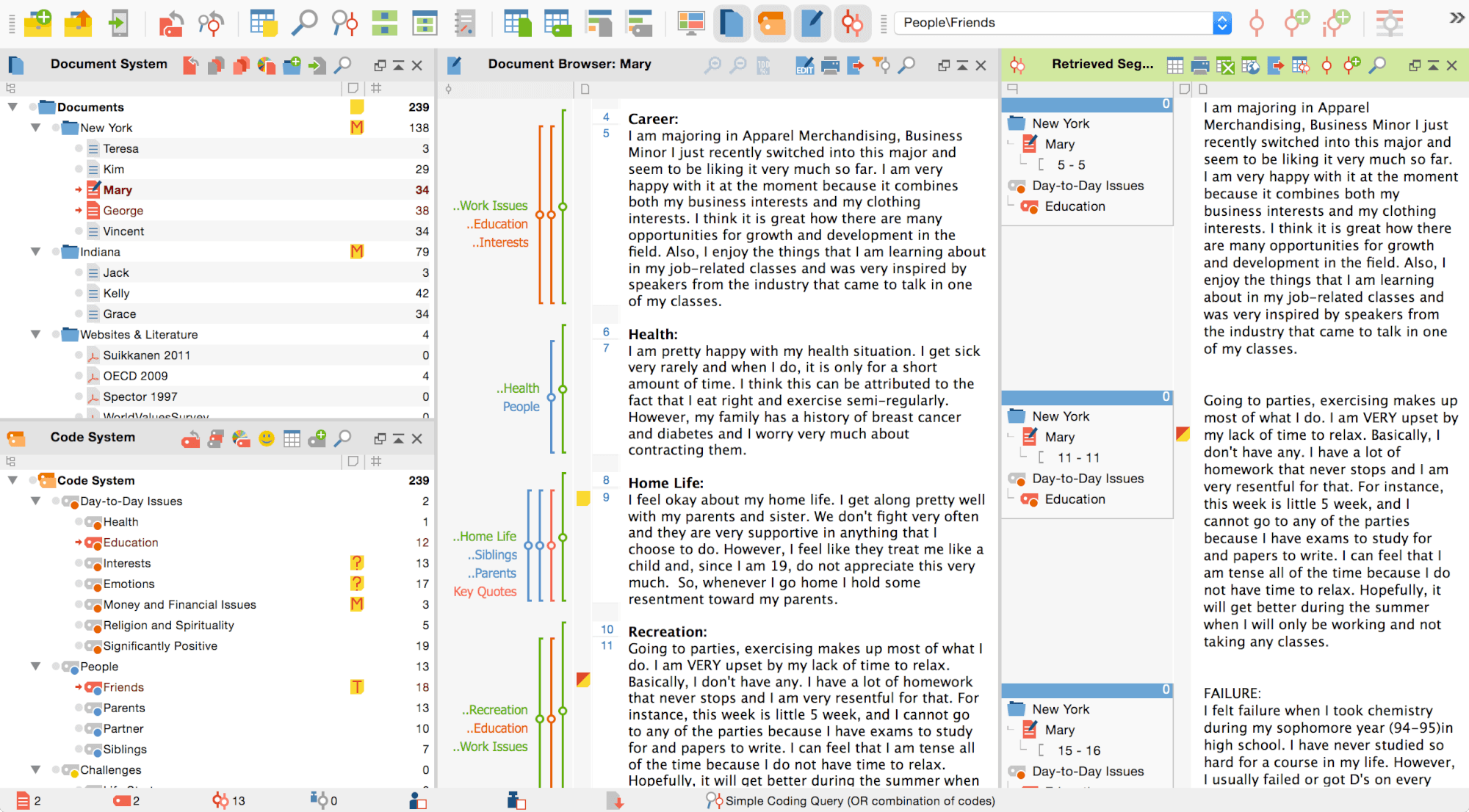
MAXQDA is praised for its user-friendly design. It’s often a favorite among researchers who want a smoother learning curve without sacrificing functionality.
Key Features:
Pros:
Cons:
Why It Stands Out:
During a UX research engagement, MAXQDA’s layout allowed junior team members to ramp up quickly, making the coding process efficient and cohesive.
Tip:
Choosing qualitative analysis software is not just about features. It directly affects total cost, onboarding time, and how well teams scale.
Legacy desktop tools often rely on complex licensing models and steep learning curves. That can slow adoption, increase training costs, and make collaboration harder as more researchers join a project. Newer platforms tend to trade depth for speed, prioritizing faster setup, simpler workflows, and easier team access.
Before committing, teams should look beyond headline features and evaluate licensing flexibility, onboarding time, and long-term collaboration costs. Comparing tools like NVivo pricing, ATLAS.ti pricing, and MAXQDA pricing side by side helps reveal how different models impact real research workflows over time. For teams outgrowing legacy tools, reviewing modern NVivo alternatives can surface more scalable options.
Ultimately, selecting the best qualitative data analysis software depends on your project’s scope, budget, and how you prefer to visualize and collaborate on data. Here’s a quick recap:
Final Tip:
Many of these platforms offer free trials, so take advantage of them to see which interface and feature set resonates most with your workflow. A little upfront experimentation can save you substantial time and effort in the long run, and ensure you have the right tool to glean the deepest insights from your qualitative data. For more, check out our full guide to qualitative data analysis software
For a broader view of the tools, workflows, and AI capabilities reshaping qualitative research, check out our full qualitative data analysis software guide—it covers more tools and goes deeper on what each approach is actually best for. If you're ready to move beyond manual coding and slow exports, give Usercall a try and see how AI-assisted analysis changes the pace of your research.
Related: NVivo vs AI qualitative analysis · complete guide to choosing QDA software · automated thematic analysis and AI coding