
 Table of Contents
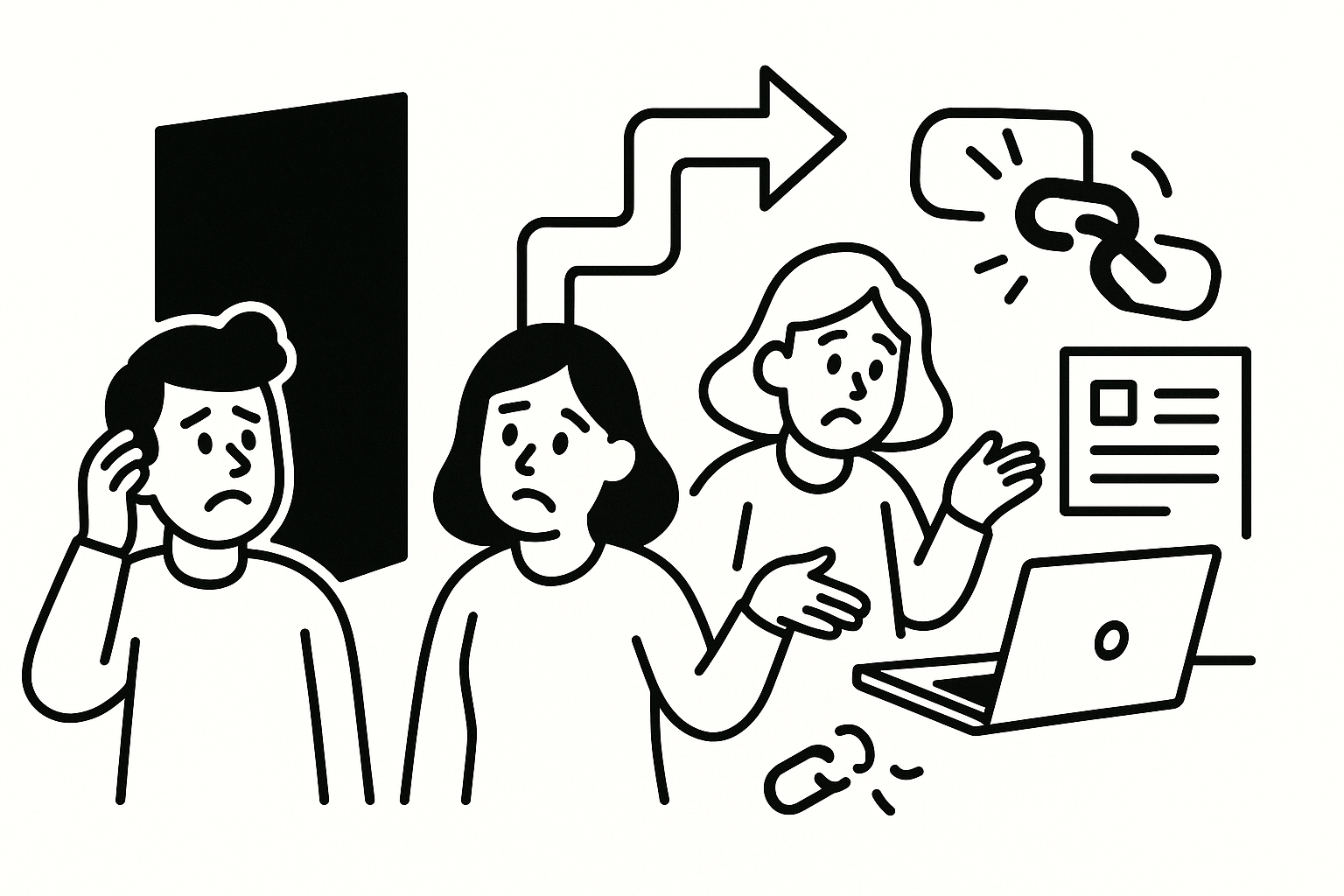
I’ve watched teams tweak headlines, swap hero images, and A/B test button colors for months—only to move conversion by 0.3%. Then we run five real user interviews and uncover a single misunderstanding that explains 70% of drop-off. The uncomfortable truth: most SaaS landing page problems aren’t design problems. They’re comprehension and trust problems hiding in plain sight.
Checklist thinking breaks because it assumes users behave rationally and read linearly. They don’t. In every study I’ve run, users skim, misinterpret, and fill gaps with their own assumptions—often wrong ones.
The worst offender is copying patterns from high-converting pages without understanding context. What works for a $9/month tool collapses for a $50k/year platform with a multi-stakeholder buying process. Complex products need clarity, not cleverness, and most “best practices” optimize for the opposite.
On a B2B analytics product I worked on (12-person PM + design team), we had all the right elements: social proof, product shots, feature bullets. Conversions were stuck at 2.1%. In interviews, users consistently miscategorized the product—half thought it was a BI dashboard, not a data pipeline. None of our optimizations mattered because the core mental model was wrong.
The biggest hidden failure: users don’t know where you fit. Not what you do—where you belong in their stack, workflow, and priorities.
Most landing pages answer “what is this?” but skip “when would I use this?” and “what does it replace?” Without that, users hesitate. And hesitation kills conversion.
In moderated sessions, I ask users to narrate their thought process as they scroll. What I hear constantly: “This looks useful, but I’m not sure if it’s for my team” or “We already have something like this… I think.” That “I think” is your lost conversion.
Clarity of category beats differentiation early in the page. If users can’t anchor you to something they already understand, they won’t stick around long enough to appreciate what makes you better.
These aren’t design issues—they’re research gaps. You only see them when you hear users think out loud, not when you analyze click heatmaps.
This is exactly where tools like Usercall become useful in practice. I’ve used AI-moderated interviews triggered right after a user lands on a pricing or signup page, asking simple questions like “What’s unclear so far?” You get raw, in-the-moment confusion at scale, not polished survey answers.
Teams often assume the landing page is the decision point. It rarely is. For most B2B SaaS, it’s the start of internal evaluation—where doubt compounds.
One SaaS security client (mid-market, ~30 sales reps) had strong demo bookings but low self-serve signup. The landing page looked solid. Interviews revealed the real issue: users were worried about internal approval. The page didn’t equip them to justify the tool to their boss.
Users don’t just evaluate for themselves—they pre-evaluate for others. If your page doesn’t help them make the internal case, they stall.
This is why conversion work should connect directly to funnel and churn research. The same unanswered questions that block signup often resurface later as churn drivers. If you haven’t mapped that, you’re optimizing in isolation. (See why users don’t convert in your funnel for how this plays out downstream.)
After a decade of interviews, I’ve stopped looking at pages as designs and started treating them as conversations. Where does the conversation break?
Most pages try to answer all four at once—and fail at all of them. Sequencing matters. If users don’t get past question one, they never engage with the rest.
I’ve run this framework across dozens of studies using Usercall’s AI-moderated flows, where users move through a page and react step-by-step. You can literally see where understanding drops off. It’s not subtle—users stop paraphrasing your value and start guessing.
The biggest mistake isn’t what teams test—it’s when they test. Post-conversion surveys and churn interviews are too late to fix landing page issues.
You need feedback at the moment of confusion, not after users have already left or committed. That’s the only way to capture genuine friction instead of reconstructed explanations.
I worked with a PLG SaaS tool (self-serve, ~50k monthly visitors) where we triggered short interviews when users hesitated on the signup form for more than 20 seconds. The insight was immediate: users didn’t understand what would happen after signup. Not pricing—process. Fixing that single gap increased completion by 18%.
This is the same principle behind when to ask users for feedback: timing determines truth. Ask too late, and you get rationalizations. Ask in the moment, and you get reality.
If you’re serious about improving conversion, stop treating your landing page as a design artifact and start treating it as a research surface.
Don’t run another A/B test until you can answer this confidently: what do users think your product is, when they need it, and why they’d choose it over alternatives? If you don’t know, your experiments are guesses.
The pattern is consistent across landing pages, pricing pages, and onboarding: users don’t drop off because they’re unconvinced—they drop off because they’re confused. You see the same dynamics on pricing pages (why users don’t convert on pricing pages) and even deeper in onboarding (why users drop off during onboarding).
Clarity compounds. When users understand quickly, everything else—trust, perceived value, willingness to act—gets easier. Without it, no amount of polish will save you.
Related: Customer Churn Analysis Guide · Why Users Don't Convert in Your Funnel · Why Users Don't Convert on Pricing Pages · Why Users Drop Off During Onboarding · When to Ask Users for Feedback
Usercall (usercall.co) lets you run AI-moderated user interviews right at key moments—like when users hesitate on your landing page or abandon signup. You get research-grade qualitative insight at scale, with the depth of a real conversation, so you can fix the actual reasons users don’t convert instead of guessing.
