
 Table of Contents
I've sat behind one-way glass watching a moderator ask a user "why did you leave the pricing page" and get an answer that no A/B test in the world would have surfaced. The user said, "I thought I was going to get charged for something I didn't understand, so I just left to Google your company name and see if you were legit." That single sentence explained six months of a client's stalled conversion rate. No heatmap flagged it. No funnel report caught it. It took one honest conversation.
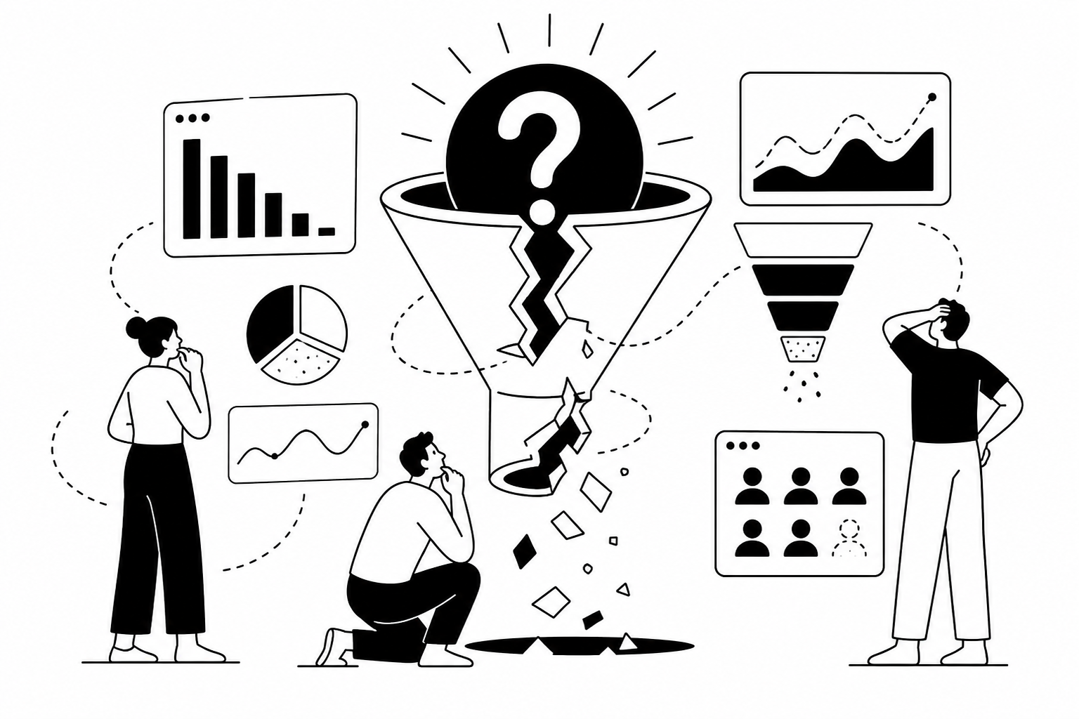
This is the dirty secret of conversion rate optimization: most teams are optimizing blind. They know exactly where users drop off, down to the pixel and the second, but they have no idea why. And when you don't know why, you're not optimizing, you're guessing with better dashboards. I've run qualitative research programs for a decade, and the pattern is always the same. The teams that win at CRO aren't the ones with the most traffic data. They're the ones who talk to users constantly, at every stage of the funnel, and use those conversations to prioritize what to test.
This post is a map of where conversion typically breaks and what qualitative research actually reveals at each stage. I'll link out to deeper breakdowns of each problem area, but the core argument is simple: quantitative data tells you where the leak is. Qualitative research tells you what's causing it. You need both, but most companies only ever build the first half.
Landing pages get more design attention than almost any other page on a site, and they still underperform constantly. I've reviewed dozens of landing pages that looked beautiful, tested well in stakeholder meetings, and still bled visitors within eight seconds. The problem is rarely visual. It's almost always clarity, relevance, or trust. When I run interviews on landing page performance, three issues show up over and over: visitors can't tell what the product actually does within the first few seconds, the headline speaks to a benefit the visitor doesn't personally care about, or the page tries to serve five different buyer types with one generic message. I covered the SaaS-specific version of this in detail in why users don't convert on SaaS landing pages, and the mobile app equivalent has its own quirks worth reading in why app landing pages don't convert.
A pattern I see constantly with app landing pages specifically: users land expecting to understand what the app does for them in one glance, but the page leads with screenshots instead of outcomes. Screenshots are not value propositions. They're proof, and proof only matters after someone already believes the promise is relevant to them. If you want a broader systematic breakdown of what's actually wrong on your specific landing page, I wrote a full walkthrough in why your landing page isn't converting, and if you'd rather run a self-serve diagnostic against your own page, there's a practical tool-based approach in why users don't convert on your landing page.
Once someone is convinced enough to consider signing up, a whole new set of drop-off reasons appears, and they have almost nothing to do with the value proposition anymore. This is where micro-friction lives: form length, unclear field labels, password requirements nobody explained, or a CTA button that doesn't match what the visitor thinks they're agreeing to. I once worked with a team that couldn't understand why their "Start Free Trial" button had a shockingly low click rate despite strong page engagement. In interviews, users told us they assumed "free trial" meant they'd need to enter a credit card, and they weren't ready to make that commitment yet just from browsing. The button text was the entire problem. Changing it to "Try it free, no card needed" lifted clicks by double digits within a week.
If your CTA clicks are low despite decent traffic, the actual reasons are rarely about button color or placement, they're about trust and expectation mismatch, which I break down in why users don't click your CTA. If people are clicking but abandoning the signup form itself, that's a separate problem worth diagnosing on its own, covered in why signup forms don't convert and why users abandon forms. And if you're seeing people leave before they even reach the form, the root causes are usually upstream, which I mapped out in why users don't sign up.
Everyone treats "signup" as the finish line, but for subscription and freemium products, signup is barely the halfway point. The real conversion event is activation, the moment a user experiences enough value to keep coming back. Onboarding is where that moment either happens or gets lost. I've reviewed onboarding session recordings where users were technically completing every step but clearly had no idea what they were doing or why. They were following instructions, not building understanding. Three weeks later they'd churn, and the team would blame pricing or competition, when the real issue happened in the first ten minutes of product use.
Here's a quick reference table I use with clients to triage onboarding problems before investing in a redesign:
| Symptom | Likely Root Cause | Research Method |
|---|---|---|
| Users drop within first 2 minutes | Setup feels like work, not value | Moderated session watching first-time use |
| Users complete setup but never return | No "aha moment" was reached | Post-onboarding interview within 24 hours |
| High completion, low activation | Wrong milestone is being tracked as success | Behavioral analysis plus follow-up interview |
| Churn spikes at day 7-14 | Value promised at signup never delivered | Churn exit interviews |
For a full breakdown of where onboarding drop-off actually happens and why, read why users drop off during onboarding and the tool-based diagnostic in why users don't complete onboarding. If your problem shows up later, after onboarding is technically finished but users still leave, that's a distinct pattern I cover in why users churn after onboarding, and if the earliest signal is users vanishing right after they create an account, look at why users drop off after signup.
Pricing pages get blamed for conversion problems constantly, and they're often innocent. What I find in research is that users usually decide whether they trust your pricing before they even scroll to see the numbers. If the page feels evasive, confusing, or designed to obscure the real cost, users bail regardless of whether the price itself is fair. I remember a session where a user pulled up a competitor's pricing page mid-interview just to compare, unprompted, because our client's page made them feel like something was being hidden. That instinct to double-check elsewhere is one of the clearest conversion killers I've seen, and it's almost entirely a trust problem, not a price problem.
The most common structural mistakes on pricing pages are covered in why pricing pages don't convert, and a deeper research-based look at what's actually happening in users' heads on this page is in why users don't convert on pricing pages. If you want a self-serve way to figure out where your specific pricing page is losing people, there's a practical breakdown in why users drop off on your pricing page.
For ecommerce and product-led companies, the product page and checkout flow are where purchase intent either survives or collapses under last-minute doubt. This is a different psychological moment than earlier in the funnel. The user has already decided they want something. Now they're looking for a reason to feel confident enough to actually pay. Product pages fail for surprisingly mundane reasons: missing size or spec information, unclear shipping timelines, reviews that feel fake or too polished, and images that don't answer the specific question the shopper has in their head. I documented the most common patterns in why product pages don't convert.
Checkout abandonment deserves its own category entirely because the drop-off usually has nothing to do with the product and everything to do with the transaction itself: unexpected fees, forced account creation, too many steps, or a payment method that isn't supported. I broke down the most common causes in checkout abandonment reasons, and there's a more diagnostic version for teams trying to find their specific cause in why users abandon checkout.
Free trials create a strange conversion dynamic. Users get access to the product, which should reduce risk and increase conversion, but it also removes urgency. I've interviewed dozens of trial users who genuinely liked a product and still let their trial expire without upgrading, simply because nothing forced the decision. The most common reason trials fail to convert isn't dissatisfaction, it's that the user never reached a moment where they needed the paid features badly enough to act. Free plans have a similar problem in reverse: users get comfortable enough on the free tier that upgrading never feels urgent, even if they'd benefit from it. I cover the trial-specific issues in why free trials don't convert and the free-to-paid upgrade problem in why users don't upgrade.
Here's a mistake I see constantly, even among experienced CRO teams: optimizing individual pages without ever mapping the full funnel as a connected experience. A user's decision to convert isn't made at any single page, it's made cumulatively, and confusion early in the journey often surfaces as drop-off much later, in a place that has nothing to do with the actual cause. I worked with a team that spent months redesigning their checkout flow because that's where the data said users dropped off. The redesign made no measurable difference. When we finally ran funnel-wide interviews, we found the real problem three steps earlier, on the product page, where a shipping estimate was quietly wrong. Users made it to checkout, saw the real shipping cost, felt misled, and left. The checkout page was innocent. It just happened to be where the symptom showed up.
If you're trying to figure out where your funnel is actually breaking versus where it just appears to break, start with why users don't convert in your funnel. For a comprehensive audit approach covering the whole site, read why your website isn't converting and the shorter diagnostic version in why your website conversion rate is low. If you're not even sure where to start looking, what's wrong with my website is a good first pass, and if bounce rate specifically is your red flag metric, the causes are almost always upstream of what people assume, which I cover in why your bounce rate is high.
Every example in this post came from talking directly to users, and that's the part most teams skip because it's slow, expensive, or hard to schedule at scale. Traditional research means recruiting panels, scheduling calls, paying a moderator, and waiting weeks for a report that's already stale by the time it lands. Meanwhile your conversion rate keeps leaking in ways your dashboard can see but can't explain. This is exactly the gap Usercall was built to close. It runs AI-moderated voice interviews with your actual users or visitors, at any funnel stage, whenever you need answers instead of on an agency's timeline. It surfaces themes linked directly to real quotes, so you're not just getting a summary, you're getting the evidence behind it, the kind of evidence that makes a stakeholder stop arguing about opinions and start looking at what users actually said. If you're tired of guessing why your conversion rate is stuck, run a study with Usercall and get real answers this week instead of next quarter.
